
Color Contrasts in Photography & Photo Art: 4 Principles that control Perception
- Apr 11
- 3 min read
Red is not a color. Red is a decision your brain makes before you look.
Your visual cortex registers color in milliseconds—long before you perceive shape, texture, or movement. Color isn't what you see. Color is what your brain uses to decide where to look.
And the strongest color contrasts in photography are achieved not through saturation, but through relationship.
Most photographers and Photo Artists treat color like decoration. A little saturation here, a little desaturation there. The result: images that are pretty but leave no mark. If you work in a minimalist style, you can't afford that. Every hue has an optical weight, a psychological temperature, a measurable spatial effect. Ignoring this means giving up the most powerful control mechanism visual perception knows.
Four principles that change everything.
Depth doesn't come from focus
Aperture is the obvious tool for spatial depth. Color temperature is a better one.
Warm tones – red, orange, yellow – come to the forefront. Cool tones – blue, green – recede. Your brain automatically interprets this as spatial distance, regardless of the actual depth of field.
A portrait at dusk: The blue ambient light fades into the background. The warm light of a streetlamp hits the face. The person is isolated from the image without a single aperture setting being changed. This is the logic behind "teal and orange"—the color grading technique Hollywood has been using on autopilot for twenty years.
Black is heavier than white
And: Colors have weight. Not metaphorically – measurably.
A black object is perceived by the brain as significantly heavier than a geometrically identical white one. Dark tones anchor the image downwards. Light tones appear weightless. And each color has its own luminosity: yellow is the brightest, blue-violet the darkest color in the spectrum.
Goethe turned this into a law: A harmonious balance between yellow and violet is achieved in a ratio of 1:3. A tiny yellow tent at the bottom of the picture holds its own against a massive violet night sky – not despite its size, but because of its luminosity.
If you think about composition only through the golden ratio and the rule of thirds, you're missing half the equation.
Grey is never grey
No color exists in isolation. Every color is defined – and changed – by its surroundings.
Your visual system automatically generates the complementary color to every color you perceive. A neutral gray coat against a deep green forest is not perceived neutrally. It takes on a reddish tint that no one intentionally placed there. This is called simultaneous contrast, and it is the most common reason why skin tones appear unnatural in post-production.
Most colleagues then correct the skin tone. Wrong lever. The error almost always lies in the background, which skews the perception.
Color contrasts work through reduction, not saturation.
The saturation control is the most common cause of poor color work. Not because it doesn't work – but because it's used too often.
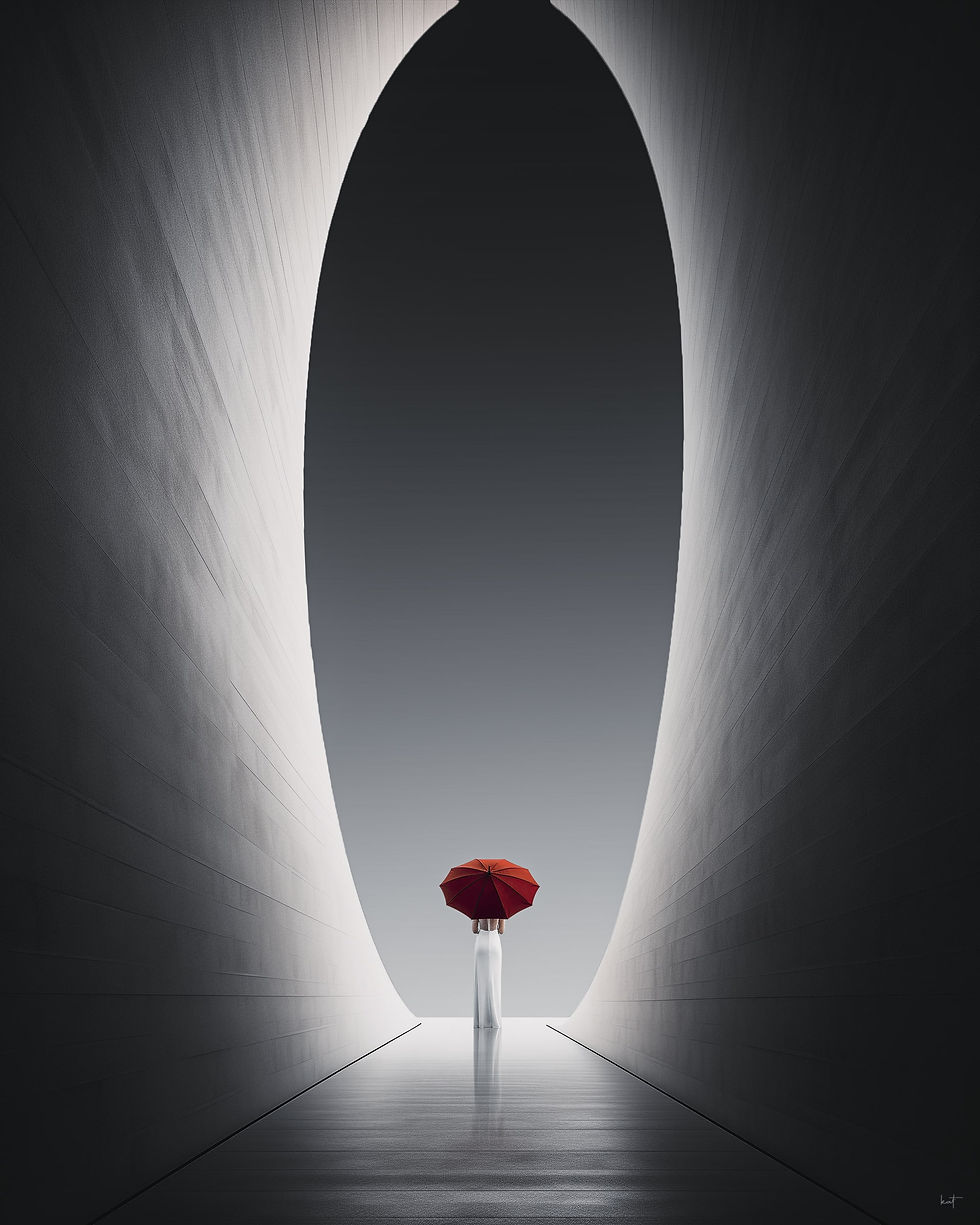
A color reaches its maximum effect not through absolute saturation, but through the restraint around it. This is the quality contrast: the deliberate contrast between bright and muted tones.
A rainy day. Gray architecture. Washed-out asphalt. A person enters the frame carrying a deep red umbrella. They become the visual center, without any manipulation of the umbrella's color. The red isn't alarming simply because it's red. It's alarming because the surroundings offer no resistance to it.
The lever
The most significant change you can make in your next image editing session has nothing to do with saturation.
Want a subject to stand out? Reduce the surroundings. Desaturate the background. Mute the neighboring colors. Place the subject in front of a complementary, muted-color background.
Colors do not exist in absolute terms. They exist in relationships.
Minimalism in color design doesn't mean forgoing color altogether. It means deciding with ruthless precision which single color is allowed to dominate your image – and letting everything else go quiet.
The next level
Four principles are a start. The rest begins when you stop looking at color in isolation and start understanding it as a compositional system. That's exactly what I teach in my online course: The Art of Minimalist Photo Composition .


